Evaluation of FMP: Ready Player One

What was your project about? What happened during it?

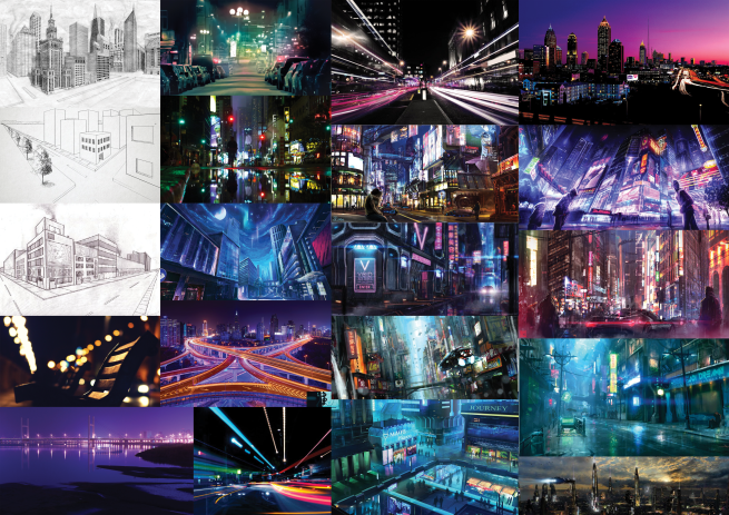
My final major project was sparked by the idea of creating a visual image from written word; taking a world that an author has so avidly described, and bringing it to life in a tangible form. I took this inspiration and looked into the work of artists that I admired – such as Mary Grandpré and Feng Zhu – to form a plethora of ideas which evolved into the essence of my final piece – a hardback dust cover.

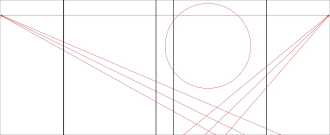
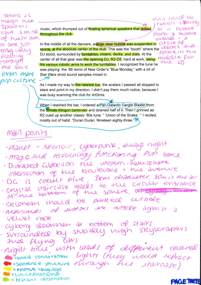
My plan for creating the book cover was to take a section of text from a book which described a landscape, analyse the text, and use the analysis to compose what I thought the landscape would look like. I would then use the drawing to create a multi-media piece, and layer text over the top of the artwork to create the cover.


What was inspiring about the project to you, and how did you translate this into your work?

My main inspiration for the project initially came from my Mother, who told me that she could never visualise the places that were described in books. This idea led me on to consider how interesting it was to me, as somebody who has no trouble visualising written word, seeing other people’s perspective on how something might look.

I carried these concepts with me throughout my project, and as I became more inspired by other artists’ work, the more inspired I was to create my own rendition of what my mind’s eye saw as I read a section of text. I translated this inspiration into drive.


Did you manage to achieve what you set out to do at the start of the project?

In essence, I achieved what I had set out to do at the start of the project, but not in the quantity that I had originally set out to complete.

I had originally planned to create five or more different book covers for books I had never read before, in order for them to be 100% uninfluenced by any other pre-existing knowledge I had about the book, or what the places within them looked like.

However, after having discussions with my peers, my lecturers, and a visiting graduate, I changed my mind and decided to create only three book covers of books I had read before and was familiar with.

This was then later reduced to just one cover, in order to give me enough time to create one very high quality, polished piece, as opposed to three pieces of a lesser quality. However, the idea for my project remained the same throughout all of these changes.


How did you feel about what happened through the project?  What was good about the experience?

For this project, I intentionally set the bar very high for myself from the beginning in order to really push the boundaries of what I thought I was capable of. Though this did cause me a fair amount of stress throughout the project, I think it helped me produce some very high-level work in the time that I gave myself to complete tasks.

Reducing my workload from over five book covers down to one definitely let me de-stress and gain some more confidence, allowing me to really push myself and create a beautiful final piece without struggling to juggle several covers at once.


What new techniques, skills, and abilities have you acquired through this project and how have they developed your creative work?

In this project, I taught myself how to use gouache paint. One of my main goals was to learn at least one new medium and incorporate it into my final piece, so I experimented with gouache paint until I was comfortable enough to create some interesting patterns and textures. This is an extremely transferable skill to me, as I work with watercolour and acrylic paint frequently and gouache is a wonderful addition to my skill set.

Additionally, during this project, I worked very hard on my time management skills – something which I have constantly struggled with in previous projects. I think this has greatly improved not only my work ethic but the quantity and quality of work I produce, as sticking to a pre-determined schedule helps me to know what work I have done, and what work I should be doing.


Overall, what did not go as well as anticipated throughout the project? W­­­­hy?

One of the elements I wanted to include in this project was using mixed media. While I did achieve this by including textures and patterns I made with gouache paint, I was very much hoping to use more than just paints and Photoshop. However, I did not give myself enough time to create these textures with different materials so I worked with the ones I had already created through experimentation. If I were to redo this project, I would allocate myself more time to create interesting textures and patterns, as I think it would really add to the overall feeling of the piece.

Additionally, I was not able to include a lot of the references I was hoping to put into the cover. I made the decision to leave out any people, text, and cars that would be in the scene, in favor of purely creating the landscape. I did this so that I didn’t totally overcrowd the image, and I was able to leave at least some negative space and allow the piece some room to breathe. However, in doing this I feel as though I sacrificed a lot of what I was hoping to include within the image – perhaps if I was just creating a landscape and not intending it to be a book cover I would have added some more intricate details and references.


How do you feel about your project as a whole?

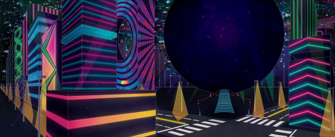
Overall I am extremely proud of my project. I think the final product is even better than the vision I had of it in my head, and while there is definitely room for improvement within it, given the time period I granted myself to create it in it looks stunning. I have definitely been able to showcase my favourite elements of the book covers I researched, from the bold text, geometric shapes, and gradients of Welcome to Night Vale, to the bright, bold colours from Snuff.

I feel as though the book cover was very well-received by my peers, lecturers, and family, and many people had high praise for the landscape itself. The whole premise of my project was to create a visual image from written word, and I most definitely achieved that goal. Several people have even asked me where they can buy the book the cover is based upon! Overall, my project has received an amazing response, and I am very proud of the work I have created.


My Final Piece: End Product and Presentation

I created my final piece primarily on photoshop; adding textures I had created with gouache paint into places such as the background and on the globe to help add interest to the piece. I created it on a canvas that was two times larger than I needed it to be in order to preserve the resolution if anything went awry in the file, and to ensure that the image would retain a lot of information and clarity when scaled down.

Screen Shot 2017-06-25 at 15.34.23

When I completed the landscape I flattened the image and opened it as a new file, adding ruler lines alongside the template I had created for the cover. I used these rulers to act as guidelines for where I was placing text; using the original Ready Player One book cover as a reference for what text I placed, and where I placed it.

Screen Shot 2017-06-25 at 15.34.47

After spending some time looking for the perfect fonts, I finally settled on the ones seen on the cover above. I wanted the type to match the landscape I had created, so I picked out a fuschia pink and a baby blue to use alongside black and white. Originally I used a yellow exclusively to color the text, but decided that it didn’t quite fit the theme I was after.

I used black drop-shadows on every piece of type to ensure it was legible, as I was worried about using two colours that feature frequently in the background clashing against a similar colour and becoming un-readable. After asking for second opinions from my peers and lecturers about my choice of type, I made some final tweaks and prepared my piece for print.

IMG_20170623_175105642.jpg

I was unable to present my work how I had originally hoped to upon a plinth, so I had to adapt to the situation and compromise. I had my book cover printed on an A2 sheet and cut it down to size on the guillotine. I then folded it around the hardback book very carefully until it was secure, and placed it open with the spine facing outwards. I presented it in front of a Macbook which showed an image of the landscape itself, alongside my information and my artist’s statement (shown in the bottom right-hand corner).


Development of my Final Piece

During the creation of my final piece, my artwork underwent several variations and changes. I created a GIF to showcase the development and progression of my piece, alongside the decisions made to alter and change some bits along the way.

Progress-GIF-1-sec.gif

As shown in the GIF, I started with a blank canvas (double the size of the print I needed) and drew a horizon line and two vanishing points. I then drew two roads branching off the vanishing points, ensuring that they crossed near the middle of where the front cover would be.

I then drew in my buildings, colour-coding them so that the lines and perspectives were easier to keep track of, before merging the layers and making them black.

From there I began adding in my details – patterns on buildings, street lamps, lines on the roads, floating buildings, the lines for the red velvet rope, amongst many other things.

After that, I blocked in colours on the ground, on the road, and added a gouache painting to fill the sky. I also blocked in the colours of the buildings and the streetlamps, altering them as I went to give the impression of close buildings being more saturated, and other buildings becoming less saturated and lighter as they grew further away.

Following that, I painted in zebra crossing lines, the staircase, the red velvet rope, the light from the street lamps, and some neon lights to a few buildings. I also corrected some of my colours in the piece to make it appear more put-together, and to fix some of the lighting. I followed the colour correction by adding gradients to the buildings, the ground, and the Globe to give them some more perspective.

[Not Pictured] At this point I attempted to add in a crowd of people around the Globe, and draw in some flying cars in the sky. However, I felt like this really overcrowded the piece and decided against including any people in the final. My main goal of the project was to create the landscape that Cline was describing in Ready Player One, so I left any trace of living people, NPC’s and Cars out of the scene. It is entirely the buildings, the roads, the night sky and the lights.

As I began colouring the piece I decided I wanted to leave it line-art free, however, having so many dark colours together in one place made the piece look extremely muddled. After a few rough experiments, I decided to completely recreate the line art over the top of the colour in a light purple to break apart the dark shapes and add some more definition. I set this line art layer to the Hard Light setting and lowered the opacity so that it did not appear too harsh.

From there I added more details to my buildings; adding more neon lights and windows and small details to add more interest to the piece. I also added a glow around each neon light so that the piece didn’t look so flat – I wanted it to look more dimensional. I adjusted gradients, colours, and shapes until I was happy with the final product.

When I finished my piece I added some final touches – some rays of light, some floating dots of light (both white and in colour), some extra darkened areas and lightened areas, and some patches of additional colour.

Developing Sketches

After deciding to develop my sketches further on Photoshop, I experimented with angles and perspectives at which to present my piece. I drew inspiration from all of my thumbnails and sketches – namely the middle right thumbnail as that was my favourite of the batch. All of the lines are drawn in red against the black book guidelines.


cover 1

This piece has a high horizon line and vanishing points right at the edge of the page. This means that this appears to be a very aerial view, which is too far away to really hold much detail. This would not be a very effective piece to use.


cover 2

This piece has a slightly lower horizon line, with one vanishing point a quarter of the way across the line, and the other vanishing point going off the page. This too is an aerial perspective, and while I think it looks better than the first one, it is still far from being something I want to work with. I added some colour and buildings to this one to try and bring it to life a bit, but the angle just didn’t seem right to me.


cover 3

This piece has a much lower horizon line, giving the appearance of looking up at the globe. I think this angle is much more appealing, however, the vanishing points do not hit the edges of the pages, and I think it might look more effective if they did. Additionally, the globe looks too small, perhaps some of the top should be cut off to further emphasise how big it is; too big to fit on the page.


cover 4

In this piece, the horizon line has been raised slightly higher than the previous version, and the vanishing points are on the edges of each page. I have also made the Globe significantly larger, so that it appears to be as big as I imagine it would be. This is my favourite development of the lot, so I have decided to take this further and build my whole scene around it. This basic outline will serve as a great base to work around.

Thumbnails and Sketches

I am very new to the concept of book cover design, so using my measurements I started roughing out the proportions of the cover and sketching out some ideas of how to lay out the cover. I knew that I wanted the Distracted Globe and the intersection to feature on the front cover of the book as they are focal points of the piece of text I chose, so I stuck to that idea and built others around it.

scan-0001 (1)

After spending about 2 minutes on each of the thumbnails above, I used the template I created to develop the middle-right image.

scan-0001 (3)

While creating this developed image really helped me to understand how I wanted to lay out my piece, the proportions in it are very wrong. The globe is too high-up and it is far too small, the car is too big, the buildings are too small, amongst other things. In light of this, I will be taking my experiments to photoshop so I can easily alter the size and dimensions of things without having to erase them completely before drawing them again. I feel as though doing this will save me time, and help me to produce some better visuals with more accurate proportions.

Presentation of my Piece

My copy of Ready Player One is a paperback. This presents a problem, as the book cover I am designing is intended to be primarily a dust cover for a hardback. I really don’t want to destroy a book in order to present my final piece (by gluing a print of my cover and sticking it over another), so I have decided to simply print out my cover and wrap it around one of the hardback books I own.

Going down this route makes it very easy for me to know my measurements and proportions for my final piece. I have decided to use my personal copy of Harry Potter and the Sorcerer’s Stone for display purposes, and replace its own dust jacket with the one I create. I chose this book in particular because the book is of a similar length to Ready Player One, and the proportions of the cover are simple and easy to work with (they are mostly integers, so I won’t be fiddling around with decimals).

The size of the entire dust cover laid out is 57cm x 23.5cm (length x width). This is then split into five different sections to cover the book – the two wrapping pieces at the edges that hold the cover in place, the front and back covers, and the spine. The proportions of these pieces are as follows:

  • Right Wrap: 11cm x 23.5cm
  • Back Cover: 16cm x 23.5cm
  • Spine: 3cm x 23.5cm
  • Front Cover: 16cm x 23.5cm
  • Left Wrap: 11cm x 23.5cm

Being a visual learner that finds things easier to understand in a diagram, I roughly wrote and drew this all out so that it’s easier for me to understand. It might not make sense to other people, but it’s notation that I know and understand, and can work with easily.

scan-0001

(W= Wrap, C = Cover, S = Spine – all measurements are in centimetres.)

With this, I created a guide in my sketchbook which was roughly proportioned correctly. I used one side of the page to experiment on, before deciding that it would be more worthwhile to create a correctly proportioned template and use that instead.

scan-0001 (1).jpg

I then took this knowledge to Photoshop, creating a template 2 times bigger than the actual measurements so things can be scaled down without losing quality, and definitely be in proportion. I then set out the measurements visually and in text, so I can use it as a guide for creating my final piece. The spine is in purple, the covers in pink, and the wraps in orange.

cover measurements.png

This will really aid my project as I can take the template I have created and print it to use as a template for my sketches and experiments. To make the template to draw on I simply removed the coloured backgrounds and the text, and added a border to make this:

cover measurements template

I can use this both for sketching on as a print, or digitally as a guideline. When printed it will be on A4, so it won’t be entirely to scale but it will be in proportion, which is a very valuable resource for me to use.


Two Point Perspective

I think two-point perspective would be the most effective method to use in order to create this cityscape. The Distracted Globe is at an intersection, so two point perspective would allow me to create that much easier than one-point perspective.

To teach myself two point perspective I did it in much the same way I did with one point perspective – through an instructive video. Namely, this one:

youtube https://www.youtube.com/watch?v=1Fcbk_K5qWA&w=560&h=315

Following along with the video, I drew this page in my sketchbook to get a better understanding of how the method worked. The concept is extremely similar to one point perspective, so it wasn’t too difficult to get the hang of.

2 Point Perspective.jpg

After this, I decided to attempt using it to make a very rough concept for my final piece.

2 point perspective experiment.png

This task definitely helped me to understand how two-point perspective works, and how I am going to use it to help me create the landscape for my final piece. I am still quite confused about how some parts of it will work (how to make everything appear bigger and not too spaced out, where I should place the horizon line, etc), but with more experimentation, I think my understanding will increase to a point where I can coherently create a landscape.


Sources Used:

Fussell, M. (2015). Two Point Perspective. Available at: https://www.youtube.com/watch?v=1Fcbk_K5qWA&w=560&h=315 (Accessed 17 May. 2017)

Mood Board

After annotating my piece of text, I decided to create a mood board comprised of images that I feel relate to how I see the text, and images that inspire me based around the theme. This mood board specifically focuses on the city.

RPO mood board.png

This mood board will serve as inspiration for when I’m creating my final image – I can reference back to it to see what I like about the images, and incorporate some of those ideas into my own piece.


Noted Artists Featured:

  • Fussell, M.
  • Fredrickson, K.
  • Mao, W.
  • Reiffer, P.


Text Analysis: The Distracted Globe

After my talk with Jake, I went ahead and printed out an extract from Ready Player One – the description of The Distracted Globe. There were less literary techniques used by Cline than Rowling, but he did include a whole load of blatant description, which I highlighted in green.

Shown below are scans of the three pages, fully annotated and highlighted. There is a key depicting what colour of highlight means what on the bottom of the third page, alongside a bullet point list of some of the key points I found in the text.


scan-0001scan-0001 (1)scan-0001 (2)

After re-reading the text about 5 times, I have a rough idea of how I would like to portray this piece of text. All of my key information is bullet pointed on the third page, ready to be quickly referenced as I begin some idea generation techniques.

Some of my ideas for this piece include:

  • Using one point perspective to create the landscape, as it is a very densely populated urban area filled with skyscrapers and cars
  • Fiddling with the opacity of the globe itself; it’s the centrepiece of the text, so it may look effective being a completely opaque cobalt blue sphere, or a more transparent blue sphere showing all of the people inside of it
  • Sketching out the initial ideas on paper, and when curating the final book cover taking to photoshop to bring all of the mixed media elements together

Sources Used:

Cline, E. (2012). Ready Player One. 1st ed. Arrow Books, pp.182, 183.

Another Change of Plan

Today, I had a meeting with my pathway leader Jake to discuss my project. I explained all of my ideas, solved problems, and progress to him and asked for some feedback on what I could do next. He suggested to me that I don’t try and do covers for 3 books, but that I just do a cover for Ready Player One.

This would mean that I can focus all of my energy into one book, and the outcome of the covers would be entirely from my own mind. The two other books I was planning on making covers for (Lord of the Rings and Harry Potter) are hugely popular all around the world, and already have movies made about every single book. Having read all the books and seen all of the movies, my own depictions of the places in the books would be influenced – by accident or purposefully – by the movie sets.

However, Ready Player One is currently being made into a motion picture, set to release in 2017. This means that the places I am going to be drawing don’t exist in a movie set yet – the only other depictions of them are fanart. Therefore, the outcomes I produce from pulling apart the text will be almost entirely my own. This means my work will be much more original to me, it will challenge me more in the process of designing the places, and I can complete one very high-quality book cover instead of 3 potentially rushed ones.